the snack artist
As the senior design director at Anthem/SF, I was tasked with the challenge of improving brand recognition and the overall sales of Safeway's snack foods private brand, The Snack Artist.
The Snack Artist brand was launched in 2010, a year prior to my the beginning of my tenure. The project was initially briefed into Anthem/SF as a simple redesign of Safeway's house brand or "S-brand" chips and pretzels product line. As the result of some very "out of the box" thinking on the part of the Anthem/SF creative team, an opportunity emerged to do much more, and actually create a new private brand offering under the Safeway banner.
original "khaki" design system
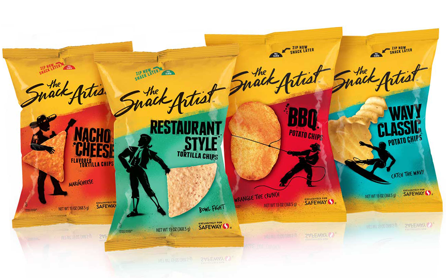
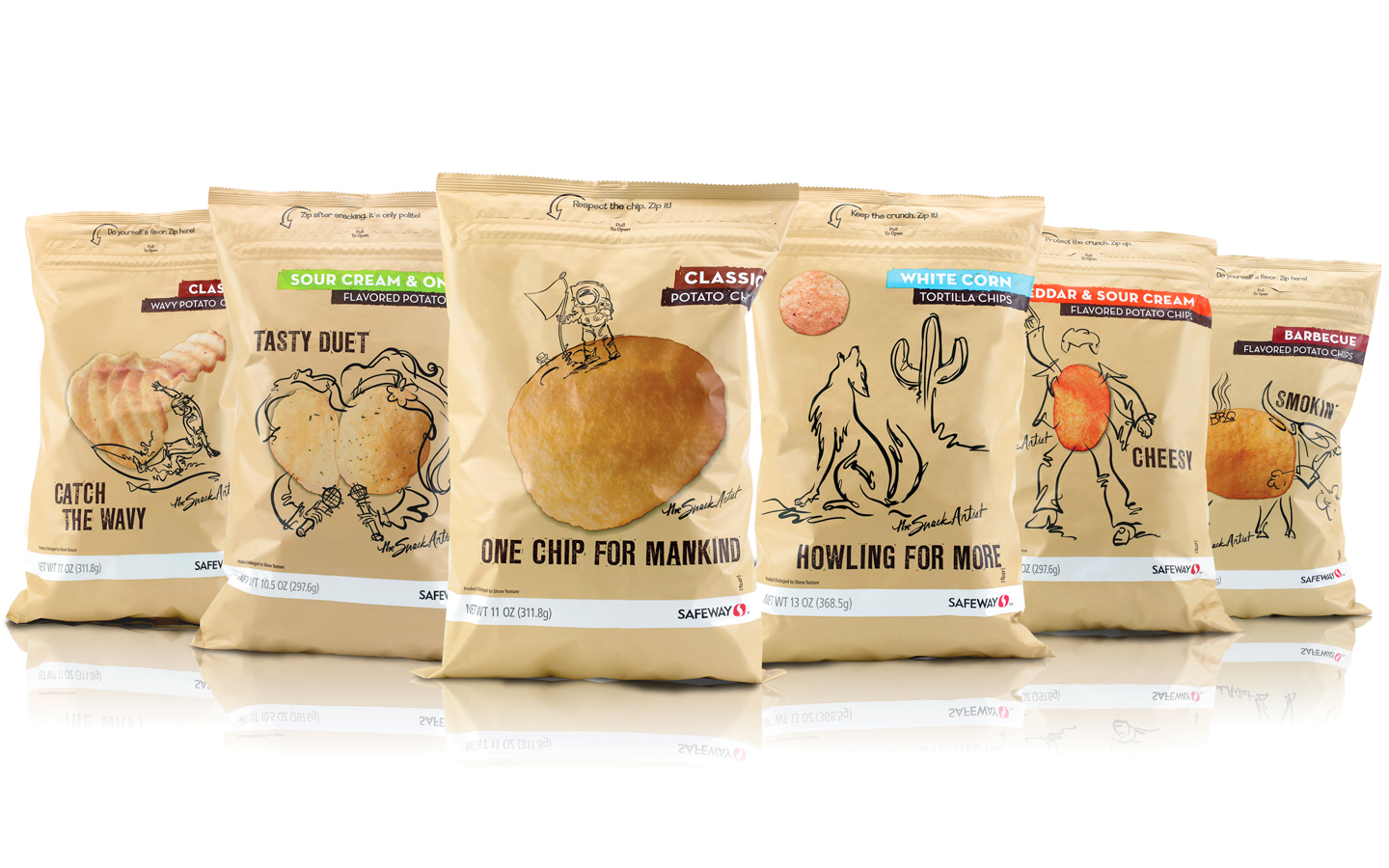
The original "TSA" system, which was comprised of salty snacks, chips, pretzels, peanuts, popcorn, and frozen appetizers, was built around the concept of a "quick sketch" artist who liked to create funny "one-liner" sketches involving his favorite snacks. The "anti-big-brand" look and conceptual approach was very well received by the creative community and it won a 2011 Silver Pentaward, amongst other industry accolades, as a result. Unfortunately initial sales weren't as impressive. Within a year of the brand launch, Safeway presented Anthem/SF with the results of some extensive in-store consumer research and observations.
These were the key findings that drove the need to revamp the TSA design system:
• There was little to no brand recognition due to the TSA logotype being treated as an artist's signature.
• Although the matte khaki-colored substrate stood out from the competitive set, much of the product photography was lost on it as a background color, and the neutral overall cast of the packages made them recessive on shelf due to the poor in-store lighting quality.
My design team's solution borrowed from the original conceptual direction of doodling on a cocktail napkin while snacking. Additionally, we did an extensive category color audit to land on brand color that would work across the entire ever-expanding system regardless of the location within the store environment. Lastly, we optimized the TSA logotype and created a consistent, prominent, and proud placement on the PDP.


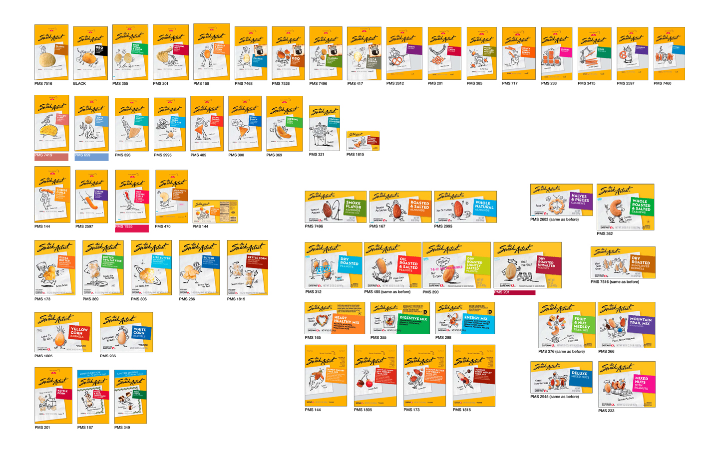
interim redesign and schematic color system guide for chips, pretzels, nuts and popcorn
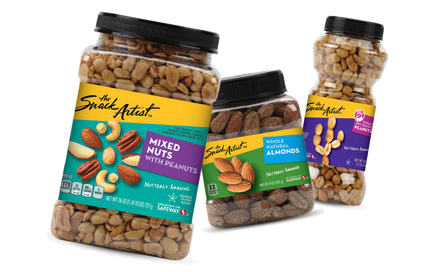
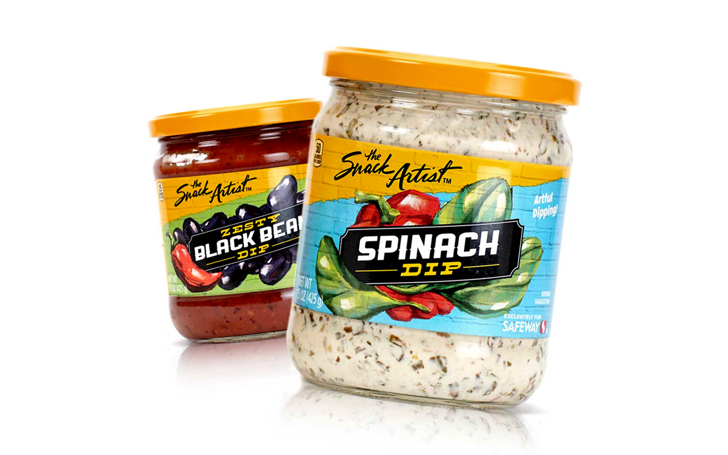
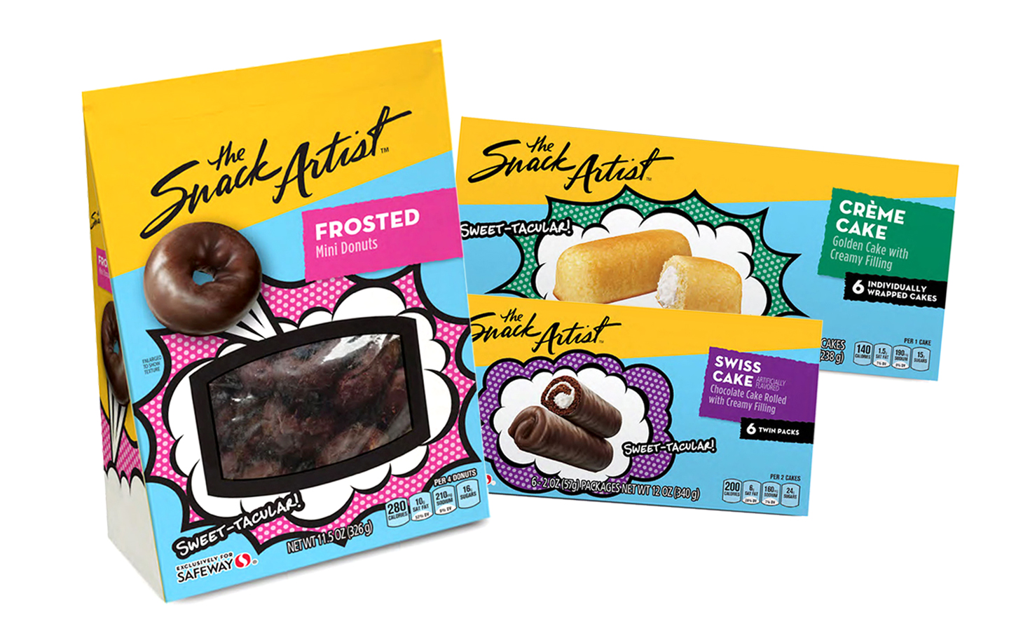
As Safeway continued to rapidly add new products and categories to The Snack Artist brand, it soon became apparent that despite the success of this update in solving the original system's shortcomings, this would need to be an interim solution. The sameness and reliance on a unique sketch and a corresponding joking wordplay to do the heavy-lifting on every single product and flavor began losing the originality that made the original (and much smaller) system so unique and fun.
So, we were faced with another challenge for the brand which had outgrown it’s retail strategy and design system. How do we revitalize the design system and segment the categories to perform their best within their competitive shelf sets, without losing the original essence of the TSA brand?
The solution came about through an epiphany that the "artist" could potentially work in other types of artistic media, beyond simple gestural sketches. He could broaden his skill set to create artwork that fits each product category individually and uniquely.
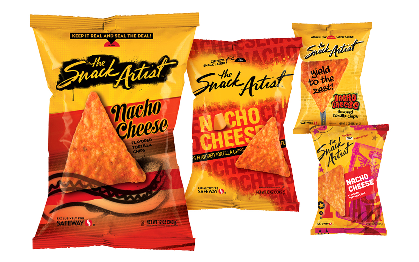

selected TSA redesign round 1 concepts
We began by determining what artistic media would be applied to the original chips and pretzels line, and worked out from there.
In every case, we took the competitive set, shelf placement, and store environment into consideration in determining the type of art that would be appropriate for each category. For example, since frozen appetizers are always behind a glass freezer door, we chose kinetic sculpture to convey the active engagement promise of the food, along with a contrasting background color that allowed the similarly-colored products to stand out behind a potentially frosted glass shelf environment.
This overall "loosening" of the rigid TSA system revitalized the entire brand and enabled the individual product lines to perform at a much more successful level within their respective competitive shelf sets.