safeway select
As the senior design director at Anthem/SF I was tasked with the challenge of repositioning and improving the quality perception and overall sales of Safeway's highest tier private brand; Select.
Upon reviewing the broad assortment of offerings under the Select umbrella we realized that the rigid design system currently in place was limiting the individual product lines ability to go up against, and beat the national brand equivalents in their respective categories. Therefore our challenge was to create a category relevant package designs that hold together as a flexible system.

previous "rigid" design system
Our research and pre-design phase consisted of solving for the following criteria:
-
Determine visual guardrails and brand positioning
-
Define how the compelling idea would be communicated from aisle to aisle
These mood boards were presented to the client in a series that built from basic design principles, to visual paths that combined the various principles in different combinations, and finally more brand story-esque narrative themes that put the principles and paths into a context that would resonate with the target consumer.

This systematic approach enabled us to quickly land on the new brand direction, "Food as Art", and the following brand manifesto: "Safeway Select is all about discovering delight through a premium expression of quality and epicurean indulgence. To convey the indulgence and originality of this brand demands a series of artfully imagined solutions. It’s about exploring the variety of places and personas where “Food as Art” can go."
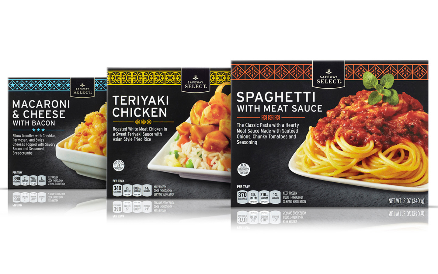
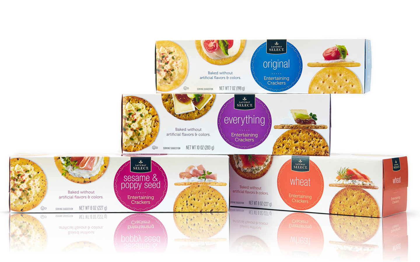
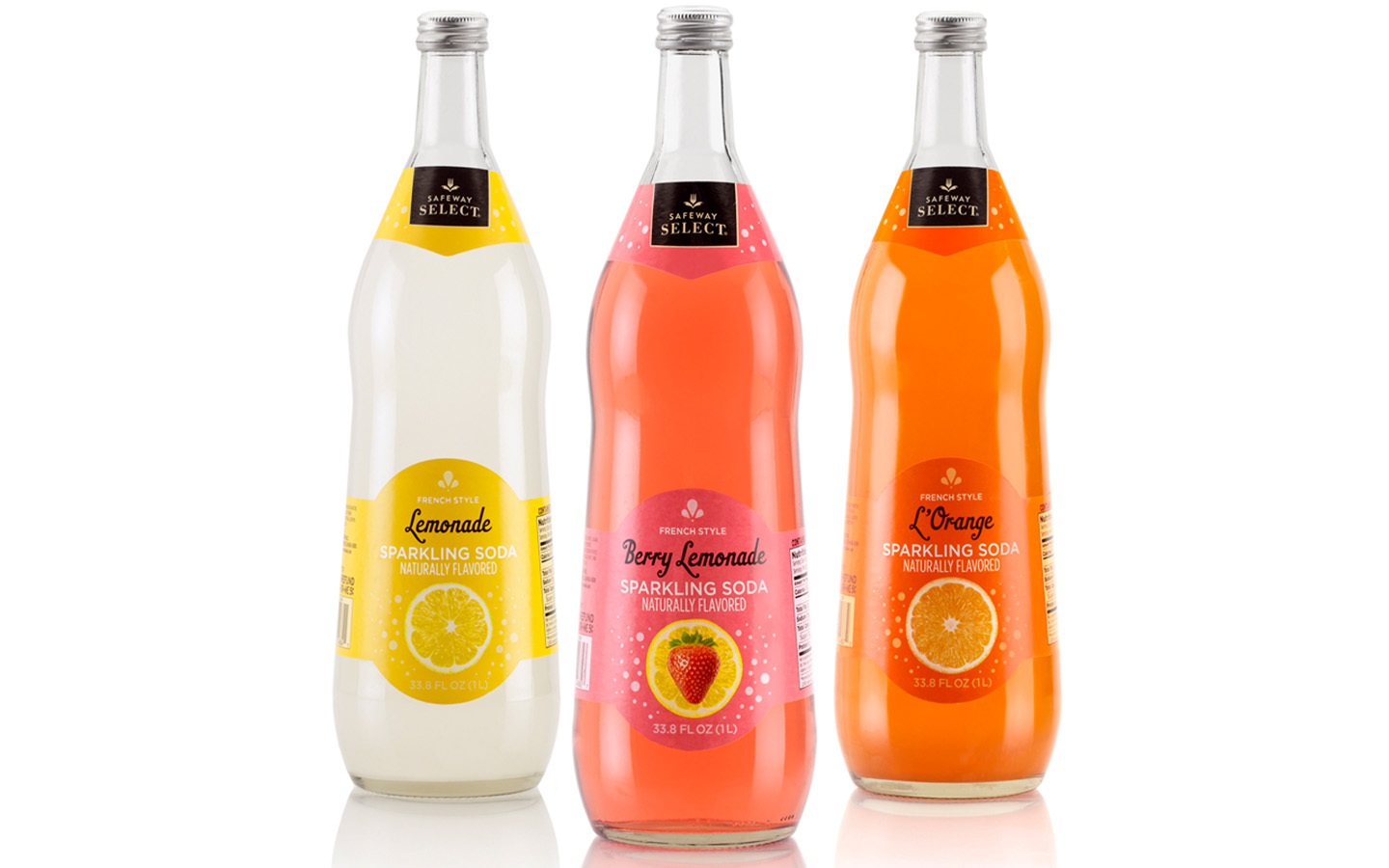
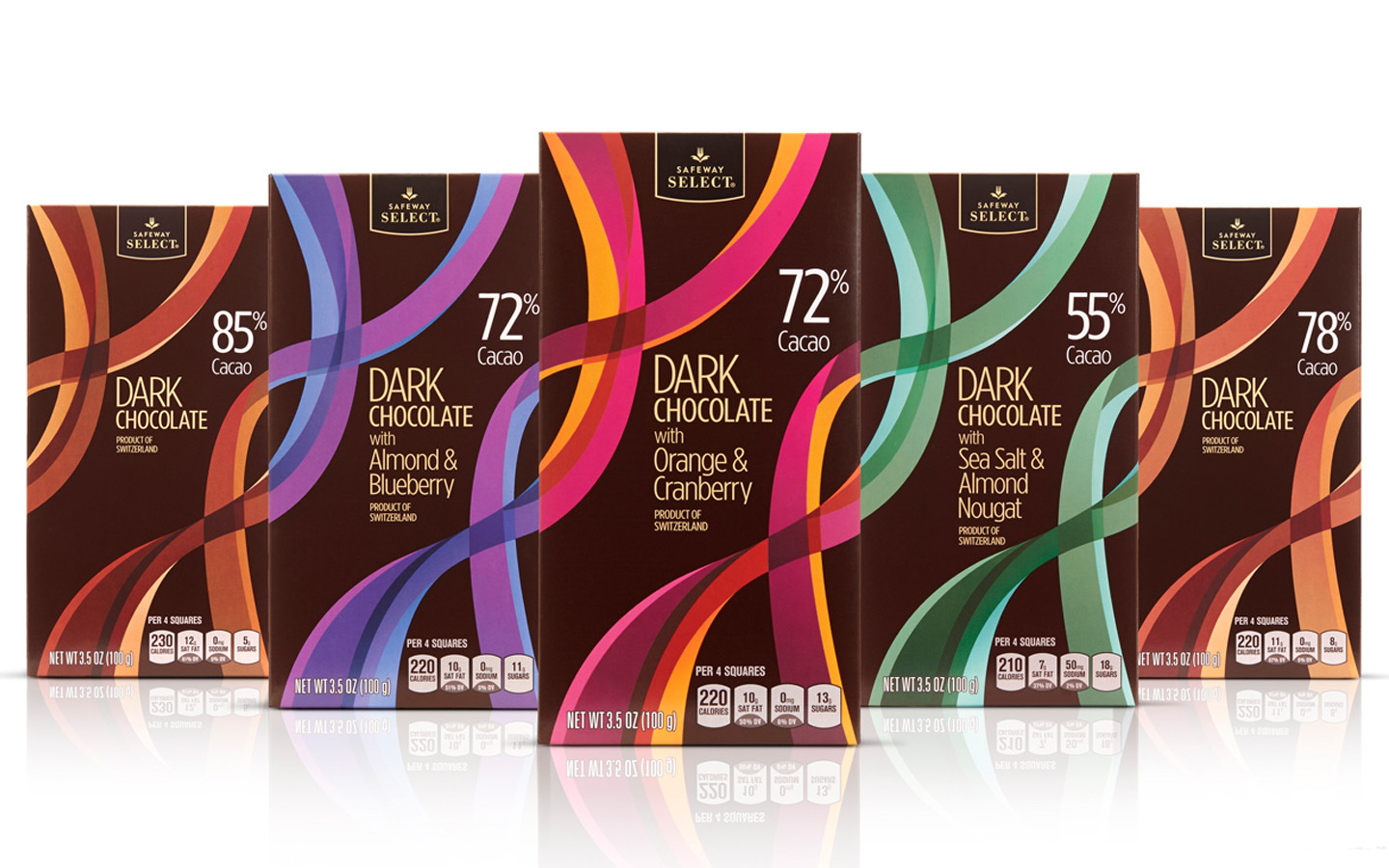
The inherent flexibility of the "Food as Art" private brand system is activated by the various "Art of" visual interpretations that were built into the system's "tool box"; along with set of five visual "stylistic keys" that were adhered to in the design development phases.
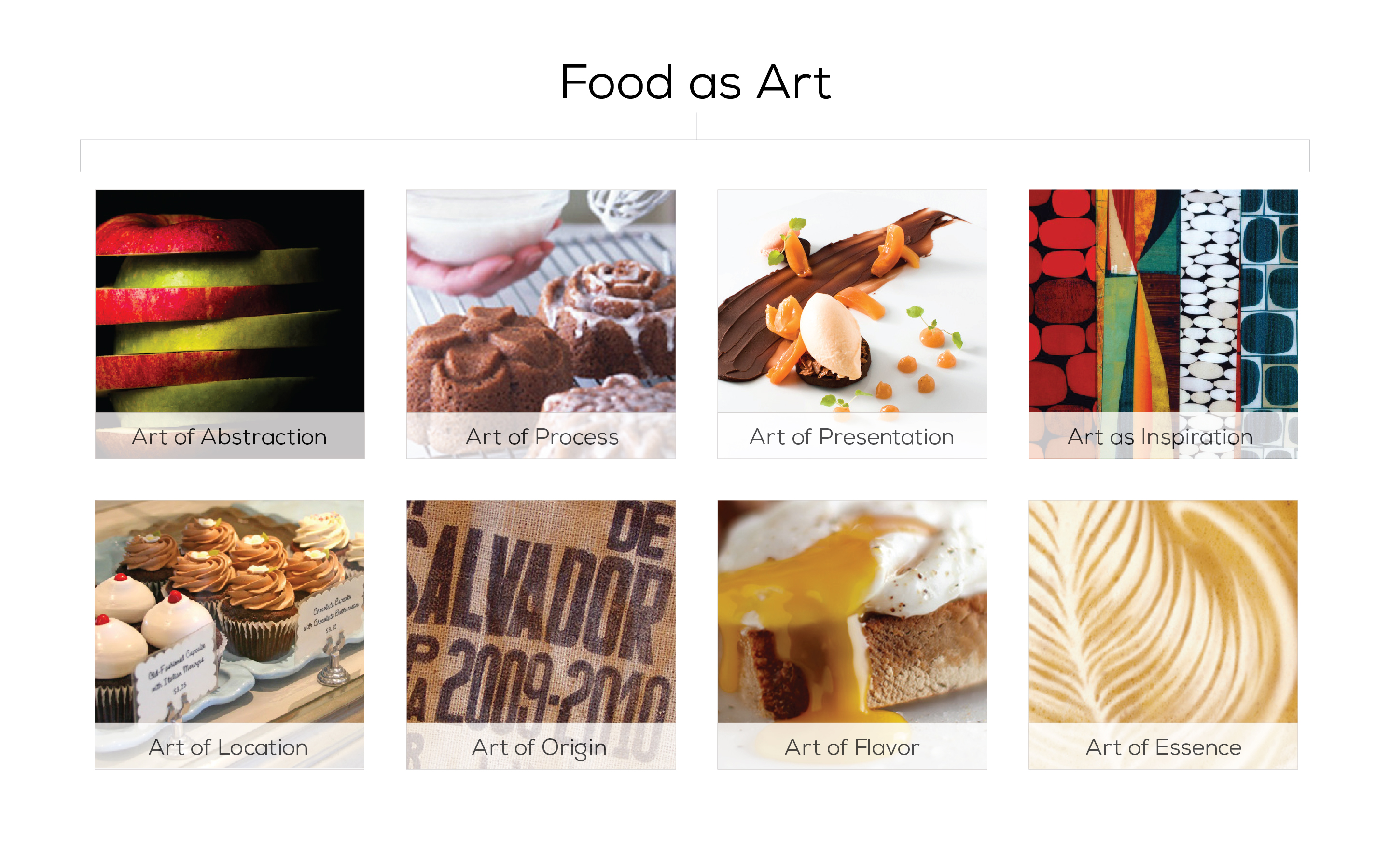
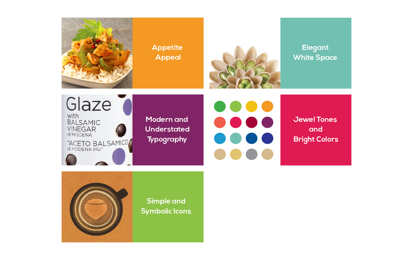
The flexibility built into this loose "system", was extremely successful in allowing individual product lines to have the creative latitude to go up against and beat the NBE products within the same category, while still holding together as a system though the varied visual interpretations of "Food as Art".
In addition to the commercial success and increased sales generated, the system garnered a total of nine CPG design industry awards from sources including:
American Graphic Design Awards/GD USA and Vertex Awards/My Private Brand.


